Article Insights now sports a new updated look to help turn the slightly drab clinical white to something more appealing… and usable.
Contents
Main page background
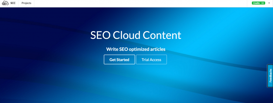
Added blue background.
Now if you click “get started” it will bring you to projects screen or login screen.
If you are a new user you can signup for trial access on the app homepage.
Subtle background
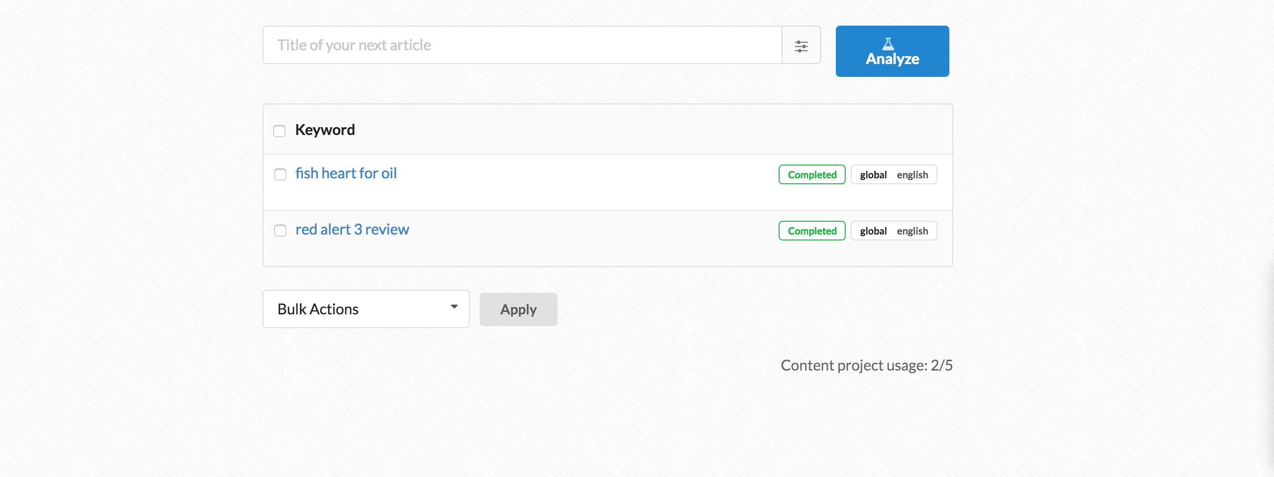
The original app had a sterile white background. To help relax the eyes and add texture there is now a subtle background to all app screens.
This also helps improve visibility on the article writing screen as article topics now stand out easier.
Bulk operations
You can select multiple keywords and delete them all in one go.
Less clicks
When you click on a keyword, it will automatically generate 10 article topics for you. No need to click “generate topics” anymore.

If you start a new article then the old 2 button choice menu shows up where article topics would normally.
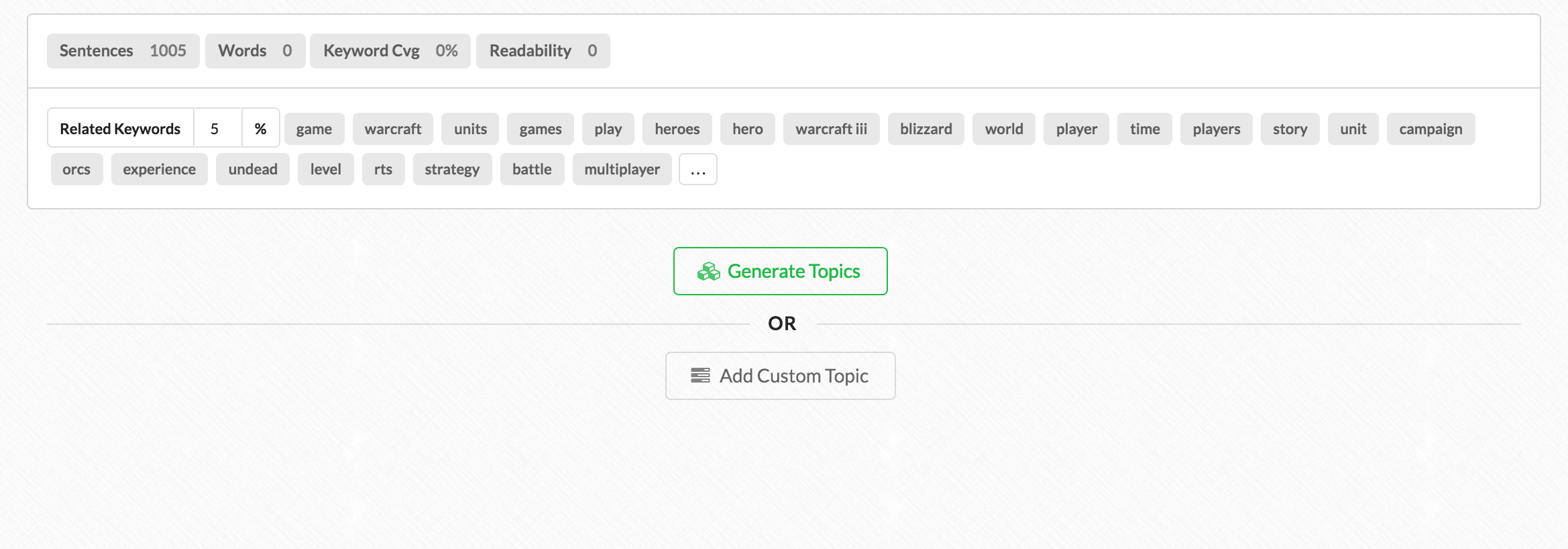
Tip: You can “regenerate article topics” by clicking on the green squares button. Each time you do so the keywords assigned to your topic will be more relevant and accurate.

Also there is a snappy little notification when Article Insights reloads article content from your last open session!

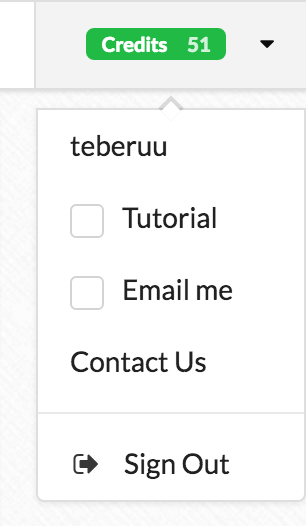
Email me!
It takes under 4 mins for Article Insights to start and complete its research. The content filtering method has also been reworked so it completes faster with the same if not better results (you should re-do a keyword and see the difference).
You can close your browser while Article Insights works in the background & Opt-in to email notifications to get a message from Article Insights when your keyword is done processing.
You can do so under the right hand side “credits” display menu.
Export your data
You can export both the content and related keywords to your hard drive from the keyword listing screen. Just hover over your keyword.

Mobile Ok
Although not a first class writing experience, the app now supports a better mobile experience. The main menu will collapse on itself.
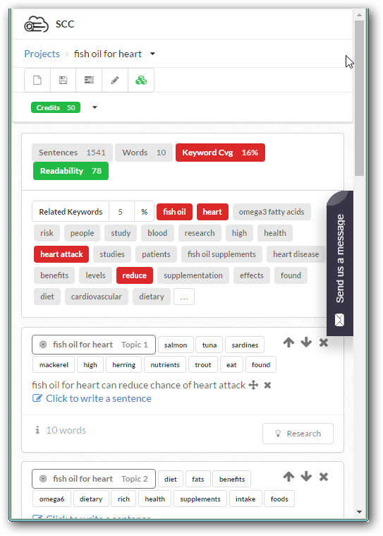
Although the alignment of some items is not correct, at least it will fit on your screen without scrolling.
