Using a new application can be difficult. The worse offenders are ones with buttons that feature an acronym with no help text.
Leaves your head wondering… what does this button do again? See mystery meat navigation.
I work hard to ensure you can understand how to use the tool with no training required.
Here are some important changes.
Contents
Tooltips
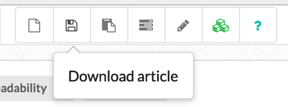
On every button or action, where it makes sense too, I have a tooltip that describes exactly what the button does.
Re-worked UI
I continuously monitor how everyone uses the tool and rework bits of the UI that is a common stumbling block for the majority of you.
You may notice this new item in the title analysis page.
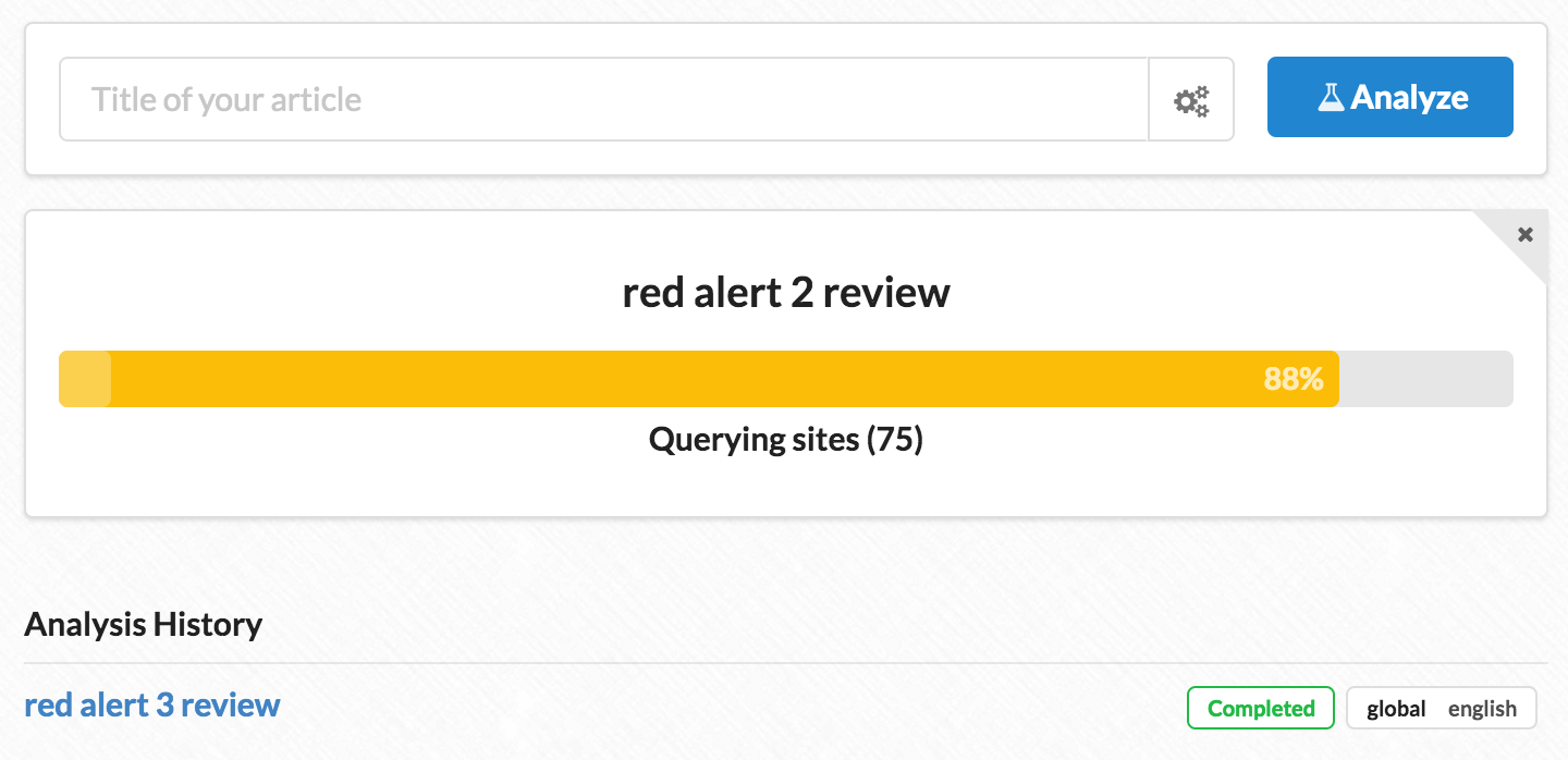
Its a big progress bar showing you that your title is ready in queue for analysis. However the most important thing is this.

Once the server processing is done, it will show you a big green “View Analysis” button so there is no 2nd guessing what you need to click on to proceed.
Compare this to before.

The title would turn from black -> blue. Thats it. However, it wasn’t obvious that it was ready to be clicked on. To complicate matters, if you hovered, some new items would appear.

Those new items are clickable and new users would try and click on them instead of clicking on the title. (Side note, if you followed the onboarding instructions it went to great pains to point out that you should click on the title… but it was still confusing)
Better onboarding
I removed automatic onboarding for new users. If you need help it asks you for it.
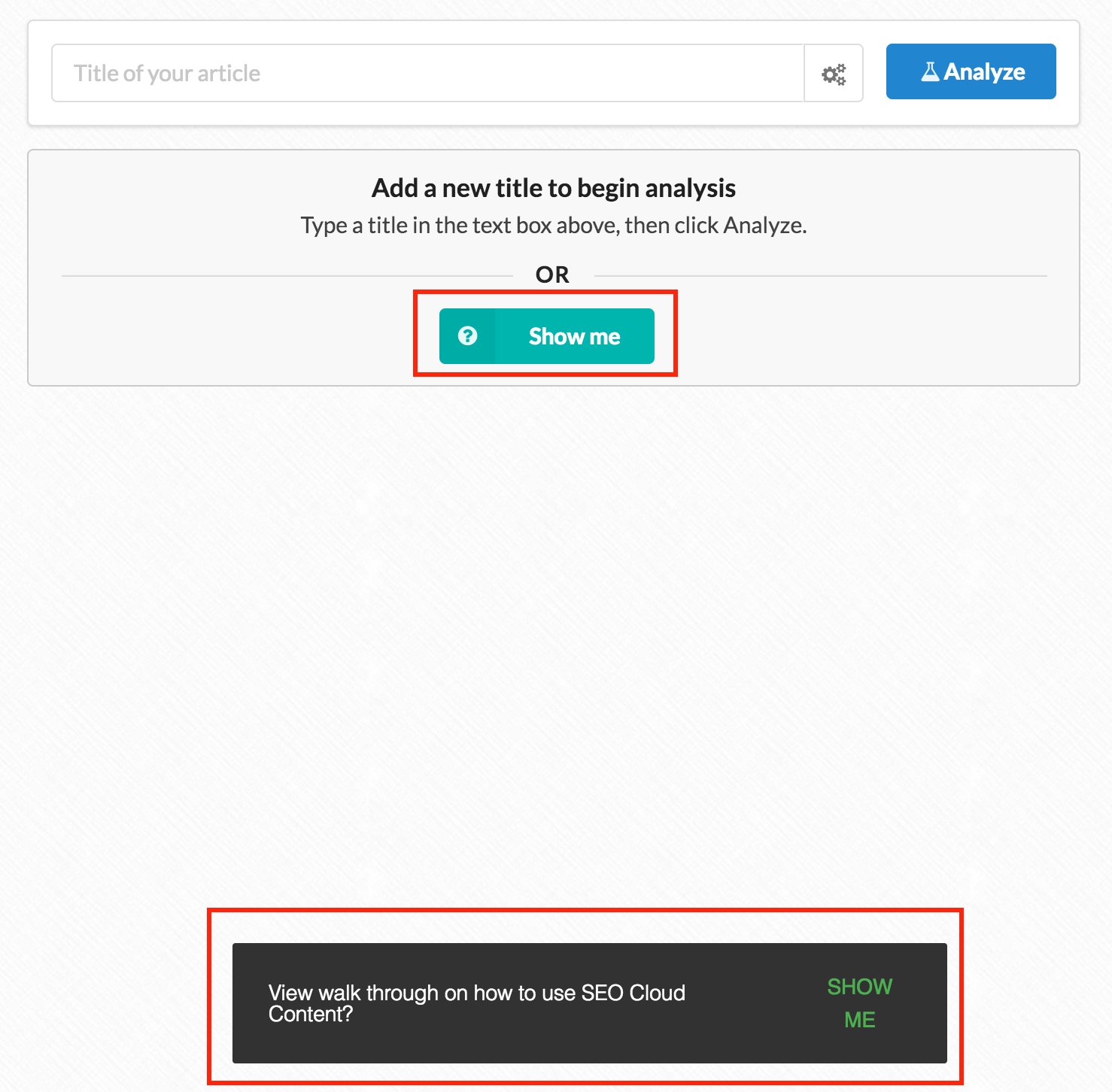
If you have never added a title for analysis, you get a button “Show Me”. At the bottom a nice little snackbar also appears to remind you if you need help.
If you click on “show me” you get this.
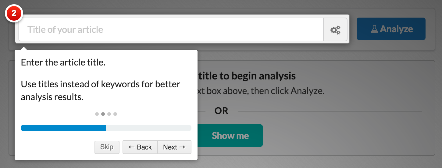
Its a quick and simple step-by-step walkthrough of what actions you need to take on that screen.
If you click “skip” or click on the black sections of the screen it will close the onboarding screen.
No more naggy onboarding
In previous versions, onboarding would automatically appear across multiple pages of the site. To do this, it had to have a global on/off button.
The effect was, if you didn’t:
a) Manually turn it off
b) Actually complete the onboarding
This would happen…
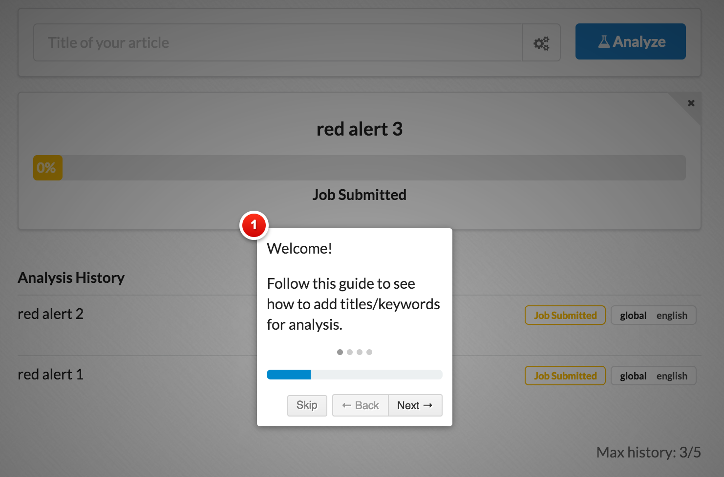
I have already added a bunch of titles to analyze. However each time I visit the page, the onboard would show up (again)!
Based on my findings, instead of finding a way to turn it off, I noticed that a lot of users would just click ‘skip’ and have the same onboard window rise from the dead next time around you went to use the tool!
Its ok now! onboarding stays permanently off unless you explicitly call for it.
FYI If you need help for the article writing screen, you can call it here!

Improved article writing instructions
The article writing/analysis screen is a bit busy. I admit that its not easy to tell from one glance where you start at and what is important (I’m experimenting with new layouts).
In the meantime, I have completely re-written the onboarding for this screen and it contains a lot more instructions.

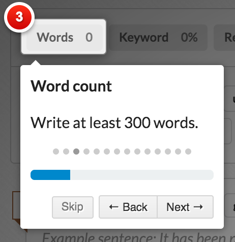
It most likely contains too many instructions, but if you go through it all, you will know exactly how to use the tool.
Beware of topic changes
The tool remembers what topics you used last time and saves what you wrote, so that if you accidently close your browser any work not saved is still there.
Unfortunately, if you change keywords, you might forget that and start writing for the wrong keyword.
2 changes to help with that.
- Color coded keyword topics. Topics of the same keyword are colored the same.
- Big card label to make the topic stand out.


Also, check the snackbar, it will remind you if you are loading old data.

It will appear at the bottom of the screen if the current keyword doesn’t match the auto generated topics displayed on the page.
Got feedback?
I welcome all and any questions. You can email me personally using the contact form or go to vote.articleinsights.com.
