I thought today I would talk about the thought process that has gone into building the new radical redesign that has taken place for Version 3.
In fact, parts of the version 3 updates have gone live already. See here.
The only major part of the UI that hasn’t been redesigned is the Article editor screen, most undoubtedly the center piece of the app.
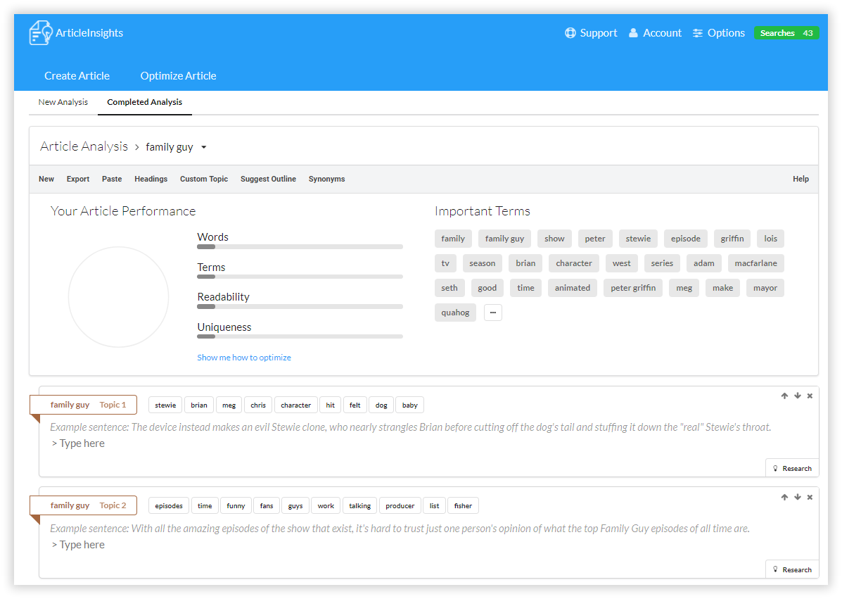
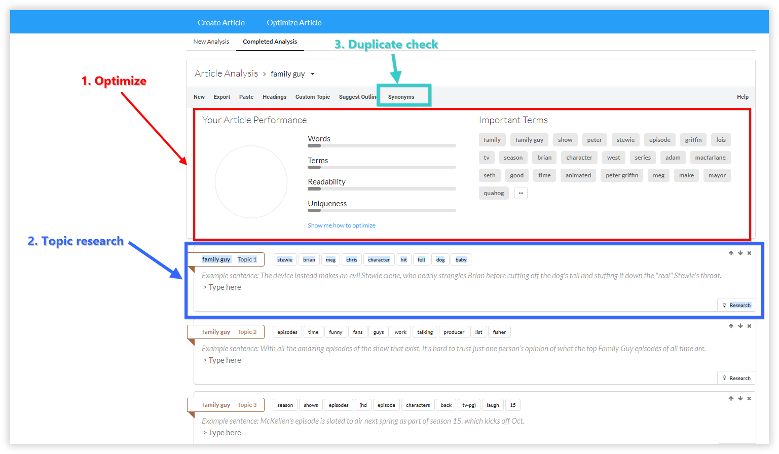
Here is a screenshot of the old version 2.0 so we can all remember what we came from.
Contents
Problems with version 2.0 editor
Here are some problems with the old version 2.0 interface.
- Its not obvious there is a text editor there, “Type here” is the closest you can get to maybe guessing what is editable.
- Lack of obvious flow, the first problem for any new person is “where do I start”. There are a lot of elements on screen, but it isn’t obvious how they all interconnect.
- The row of “Article” menu buttons is just a bad holding place for a variety of random functions that I couldn’t find a clean place to put.
- Optimize scoring is nice, but its not pinned to your window. If you scroll down to type something it disappears out of view.
- Undoubtedly many other issues….
The biggest problem I think is “wow, what do I do now”…. Article Insights actually ships with a step-by-step tutorial, but its not actually visible the first time you use the app (as per Google material design).
The reason why its not auto popping up for new users is that I want everything to be understandable without needing a step by step intro.
That is the epitome of simple design, you can pick and play without needing a step by step tutorial.
Design rules
The best way to design something is to place some rules to abide by.
In the beginning its just about trying new ideas and features, so the UI grows to accommodate ideas in a free form manner.
Now, its about learning about current user behavior in the app and modelling other successful apps that are similar.
Having rules guides design, so here are some I decided on. Some arbitrary, some based on feedback.
- The text editor is sacred. Don’t redesign it, don’t mess with it.
The version 2.0 text editor doesn’t look like a text editor. - No popups, keep them to a minimum. Instructions should appear in the app, examples can be included without needing a “click next” wizard.
- Use the entire width of the screen so that article metrics is always visible.
Introducing version 3.0 editor
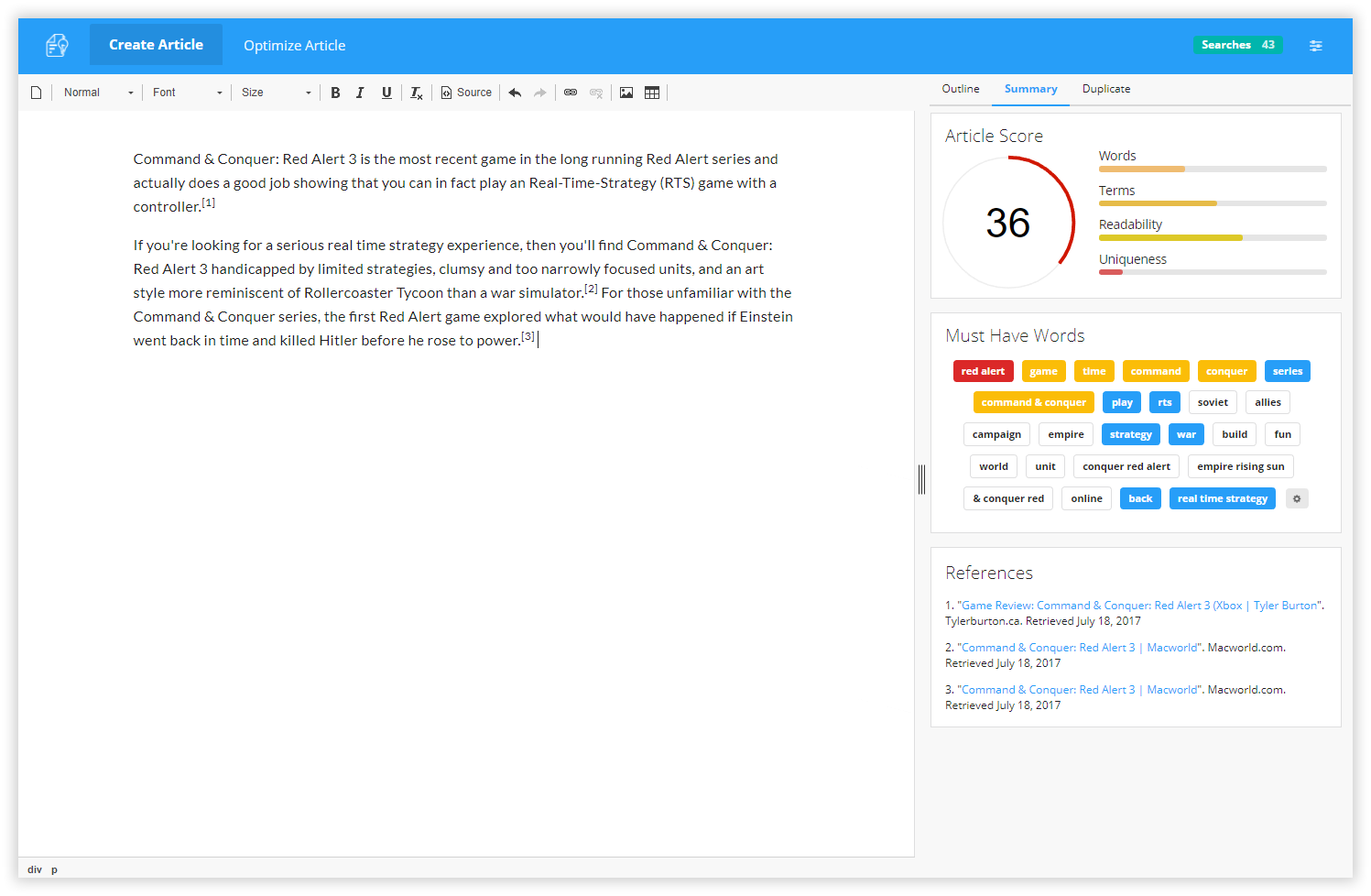
First, a picture.
Lets go through the changes.
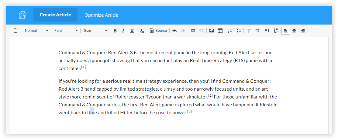
Real text editor
There is no mistake where you write and put text in. Also proper standard text editor buttons, exactly the same as the ones you find on WordPress. The important thing here is that everybody has seen this UI before so there shouldn’t be no 2nd guesses about what goes in there.
Which goes to design rule #1, keeping the text editor sacred.
If you notice there isn’t anything fancy happening in the editor, you can’t move around topics, swap sentences or click on sentences to see references (unlike version 2.0).
A good positive effect of this change coming from version 2.0
- No need for a “preview” article screen. What you see is what you get, WYSIWYG.
- No need for a “paste” button anymore.
- Editor functions Vs Article Insights functions are now cleanly separated. See next section…
Features in Tabs
Article Insights allows you to:
- Optimize your article
- Research content using topic outlines
- Check for duplicate content
Those 3 big features are dispersed throughout the version 2.0 UI in no logical easy to distinguish manner. No doubt because in the beginning Article Insights was about trying to experiment with features and ideas, before seeing how they would work in the wild.
Check out it now.
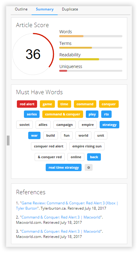
 Optimizing your article is now just a manner of clicking the “summary” tab and you can see all the numbers on the right hand pane. Best of all, its always visible no matter how far down you type or scroll.
I also changed some colors, cleaned up some areas etc.
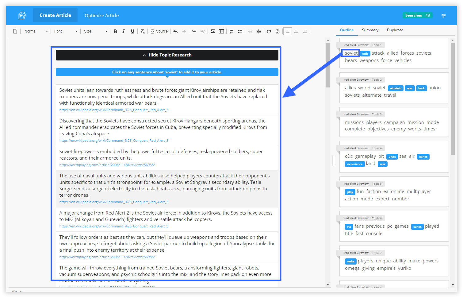
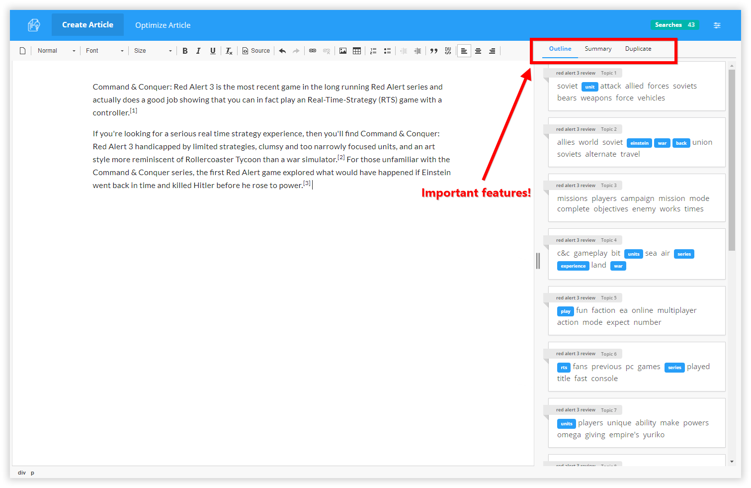
Article Insights cleverly groups sentences into topics and you can access this topic outline by clicking on the “outline” tab.
As an upgrade from version 2.0, you now get 15 topics instead of 10. The extra topics should help give you better resolution in available topics. There also has been some backend algo tweaks, so the assigned words and sentences for topics runs quicker and more accurately.
If you click on any word or even the header of the topic, the sentences belonging to that topic now appear in the article editor area. No more popups!
Your article is still there below the research pane. Interestingly, you can now open multiple research panes.
The article topic outline isn’t perfect, it isn’t obvious that for topic 1, the following words make up that topic, its also not obvious you can click on the words. Still searching for a solution to this. However this current iteration is ok.
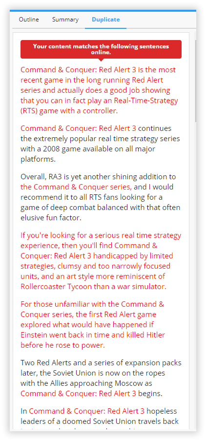
Checking for duplicates in your article?
All the detected duplicates will be shown in this pane, with the actual matching phrase highlighted in red.
Unfortunately the old synonym re-writer has gone but it may make a re-appearance if I can figure out how to add it back in a nice way.
Is it ready?
There are still some things that need to be added and further refined, however I believe “each version better”. I could spend hours tweaking everything on my dev box, but no plan survives first contact with the enemy!
Changes will be going up live soon so try it out and let me know what you think by submitting your thoughts on version 3.0.
Things left to do:
- Export/Post to WordPress?
- References tracking still wonky
- Refine further article topic UI
- Find way to add highlighting to sentences in your article that match content, instead of the other way around. Easier to edit what you know is matching then to search for it from the duplicates pane.
- Multi-keyword selection has been removed, maybe it can be brought back if warranted.
- Example text to kick start your article (priority)
Final thoughts.
- Lots of old code has been removed because it can be done naturally with a text editor. Eg, pasting, new article etc. This always makes me happy as it means I can focus on core features.
- Having a full screen text editor as the design base means I have to find much more clever and workable ways to present Article Insights features.
- Still lots of extra room for further improvement, version 2.0 was stuck in terms of how I could bring it forward.
Instead of yammering on and on about it, why don’t you give it a go right now!
[button_5 bg=”orange” text_color=”dark” text=”yes-let-me-in-early.png” align=”center” href=”http://app.articleinsights.com/analysis/new” new_window=”Y”/]
