We have a new landing page!
Below are some of the things we found out about the old page and its problems and why it was updated.
Contents
Simplified landing page
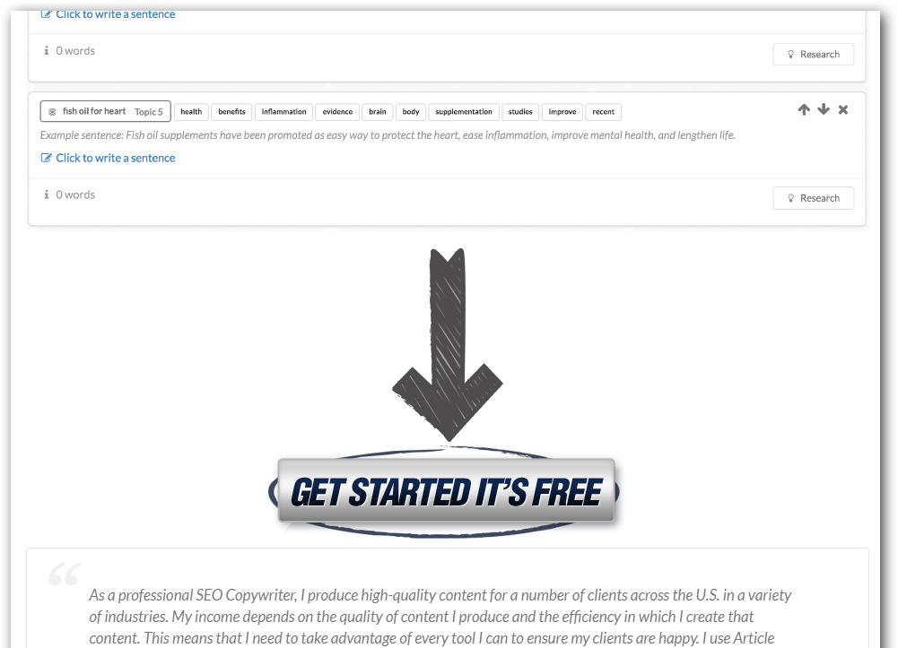
The original landing page has 2 call to actions on one page. This is confusing!
You can both:
- Signup for trial
- Pay for the product
See below for the original page.
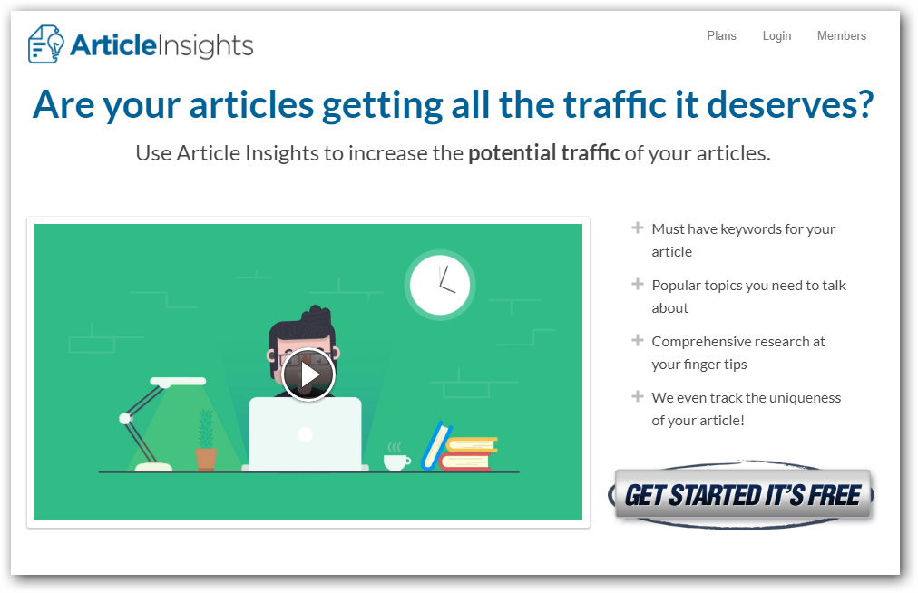
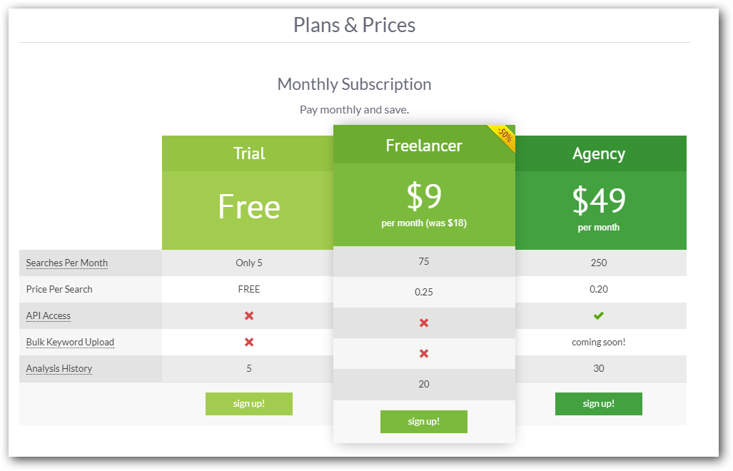
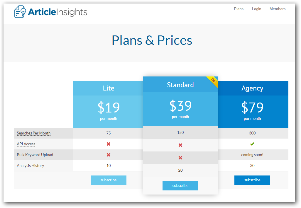
Solution: Move plans & pricing to its own page so that it’s less confusing.
Incidentally, removing the free trial option also unbalanced the pricing grid so a new pricing tier was added.
The new pricing plans are now lite, standard & agency. (The old agency plan has been renamed to standard)
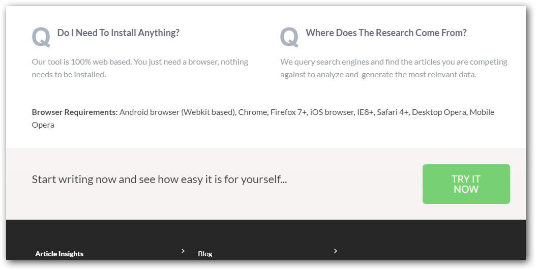
Signup button colors do not provide enough contrast and get lost with the text.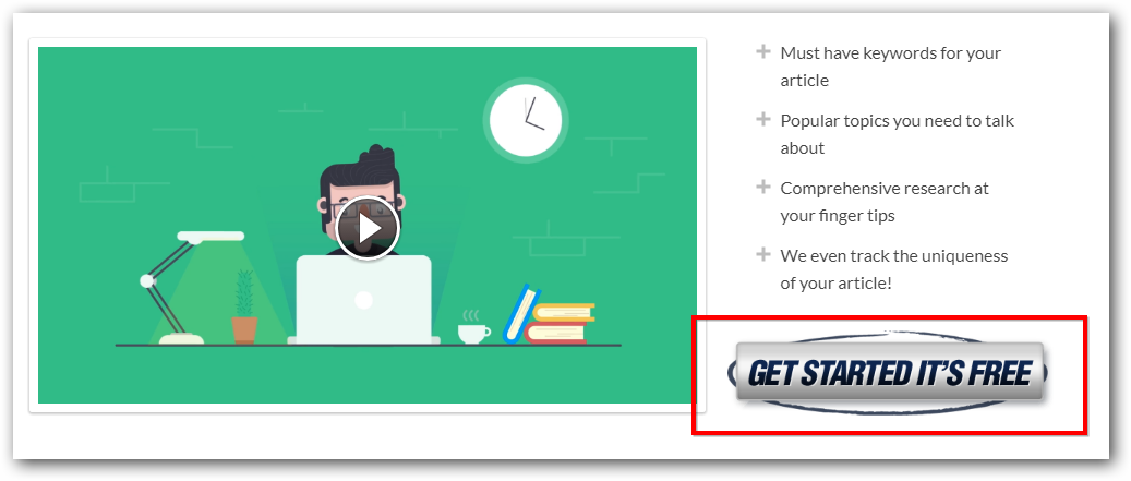
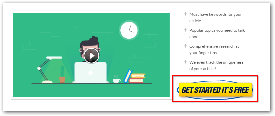
All signup buttons have been tweaked to use a color that doesn’t appear on the page. They are now yellow to help them stand out a bit easier.
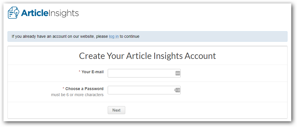
Simplified Trial Signup
No more confusing sign up text just simple 2 boxes to register your free trial account.
Autoplay Video
I had a great video done up for the tool but I think most people missed watching it. I have set it to autoplay now.