A new UI update for the article writing and research page on Article Insights has been released.
The old interface seemed cluttered, in a bid to make it look more like a standard text editor a few changes have been made.
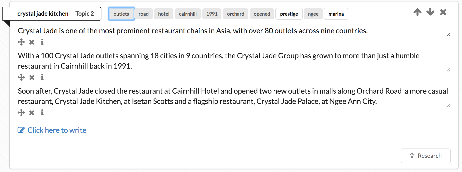
Old Topics UI

The old topic view had lots of white space between items. Sentence controls was also always visible.
Consequently it was busy, lots of things on screen at once.
After some adjusting…
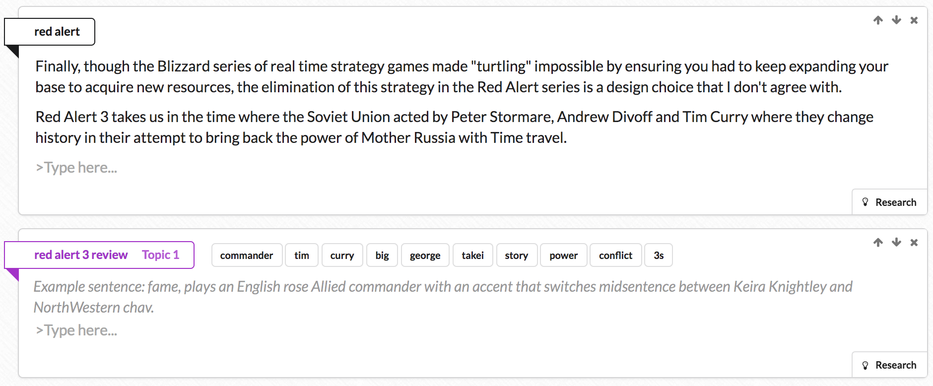
New Topics UI

All the sentence utility buttons are hidden. If you click on a sentence they will show up as usual.
The up/down topic buttons have been made smaller and stuck to the border, as well as the research button.
Consequently, the topic area is more like a print preview box showing you a closer approximation of how text will look like.
What do you think of the changes? Comment and let us know below.
